Angelica Rosu
2024
A signature for a law firm
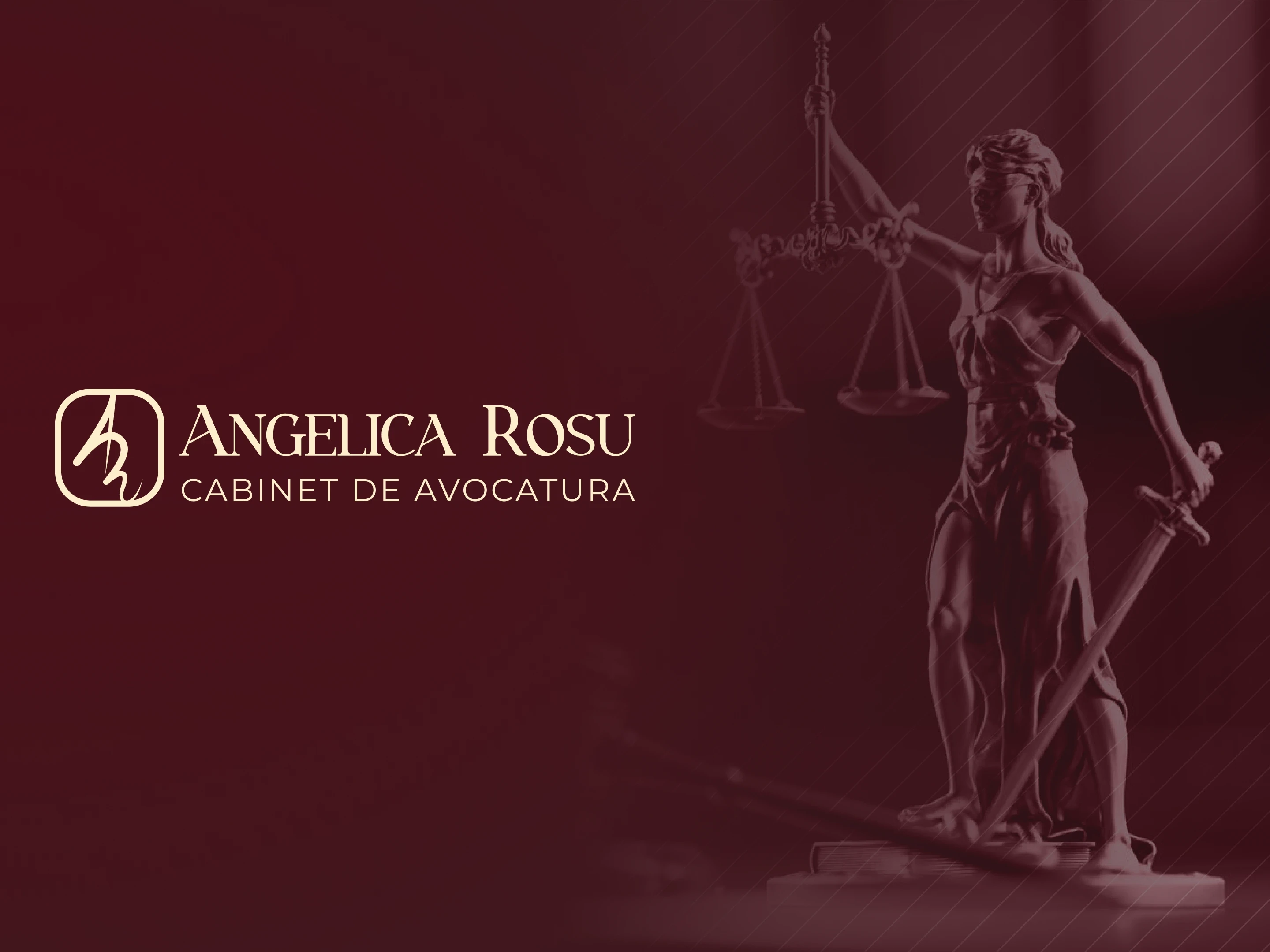
Angelica Roșu is a law firm in Galați, Romania, with more than 25 years of practice. I designed its visual identity, from the monogram and colours to stationery and a key visual, and its website.
Overview
A founder-led firm with a personal approach
The firm offers legal advice and representation to clients across Romania, with a team that covers every area of law, including commercial law, public procurement and civil law. Its promise is personal: each case is treated as unique, with care, transparency and discretion.
The Challenge
Professional, elegant, and trustworthy
The identity had to feel serious and credible, as a law firm must, without looking cold or generic. It also needed to reflect that the firm is led by its founder, who is personally involved in every client's case.
The Logo
The founder's initials, written as a signature
The monogram combines the letters A and R, the founder's initials, drawn like a handwritten signature. A signature suggests personal commitment to each client and an authentic, individual approach to every case. It is also a familiar symbol of responsibility and credibility.
The wordmark uses a serif typeface for the name, adding refinement and a sense of tradition and authority. It is paired with a clean, spaced-out sans serif for "Cabinet de Avocatură".


Visual System
Colour and type
The palette pairs a deep midnight with an electric blue, softened by lighter blues and lifted by a fresh green used for actions on the website. Poppins, a geometric typeface, echoes the round shapes of the monogram and is used in three weights: Light, Medium and Bold.


Applications
The brand in use
A logo alone doesn't make a brand recognisable. So the shapes it's built from were treated as a kit of parts, free to be enlarged, repeated or cropped, which gives campaign work a family resemblance even when the logo is small or absent. The rule is simple: the shapes can carry the message, the colour keeps everything together, and people stay at the centre of the picture.


The Website
The brand in use
A logo alone doesn't make a brand recognisable. So the shapes it's built from were treated as a kit of parts, free to be enlarged, repeated or cropped, which gives campaign work a family resemblance even when the logo is small or absent. The rule is simple: the shapes can carry the message, the colour keeps everything together, and people stay at the centre of the picture.
Outcome
A brand that fits the product's ambition
TenderCraft now has a compact, recognisable mark and a visual language that reads as trustworthy and modern at the same time. The platform reports more than 5,200 active companies and over a million indexed tenders.